
Paris is a city that wears its history on its walls. For those building vintage aesthetic boards, there is no greater inspiration than the iconic Parisian street signage that has defined the city’s visual identity for centuries. From the bold, blue-enameled plaques of the nineteenth century to the whimsical hand-painted letters on local bistros, Paris offers a masterclass in typography that blends elegance with utilitarian purpose.
The History of Parisian Street Signage
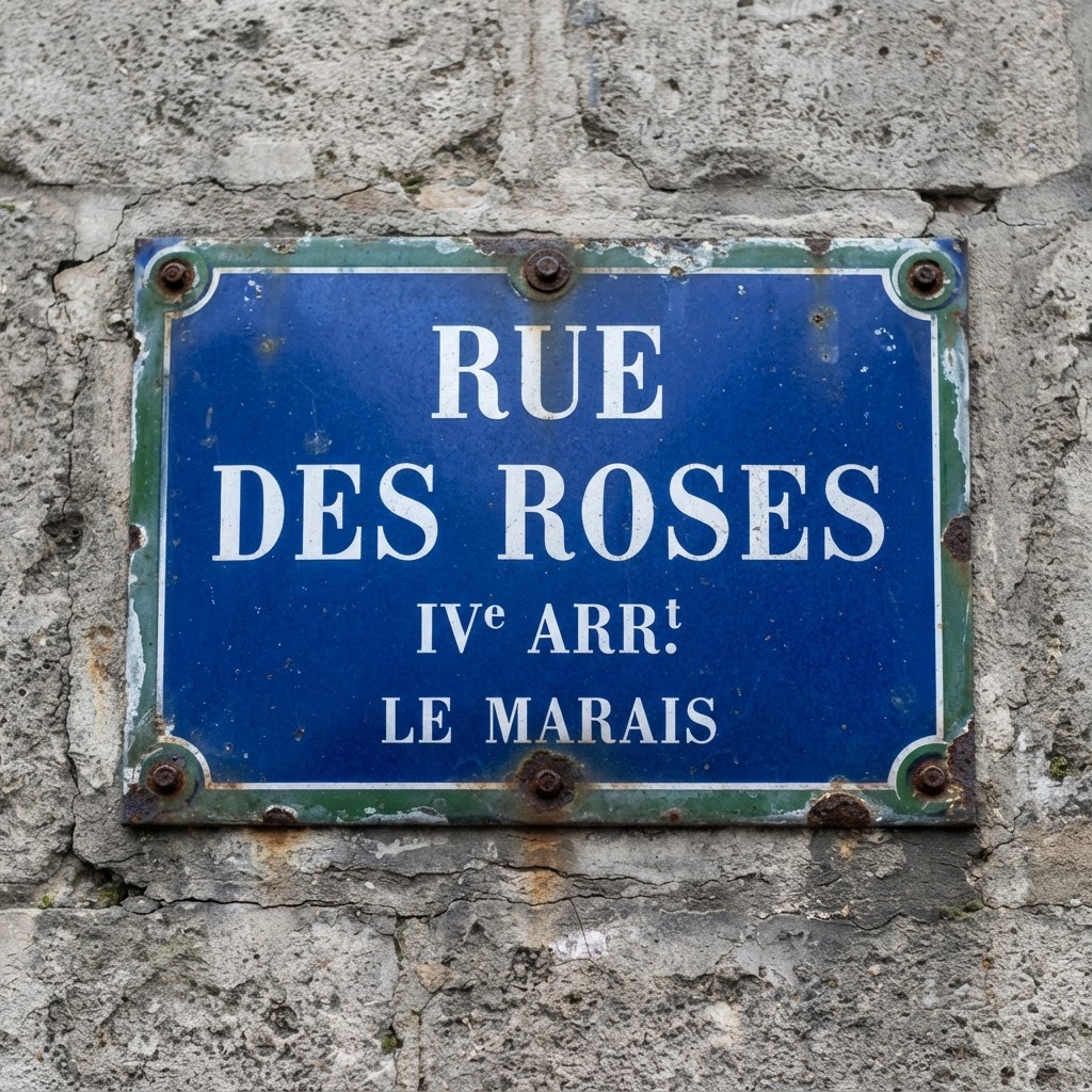
To understand the aesthetic appeal of Paris street signs, one must look at the evolution of urban navigation. In the early 1800s, the city began standardizing its signage to help citizens navigate a rapidly expanding metropolis. The classic blue enamel plaques with white lettering emerged as the hallmark of this era, characterized by their high-contrast, legible serif fonts.
The Enamel Legacy
These enamel signs are the gold standard for anyone seeking a classic French look. They were designed to withstand the harsh Parisian climate while remaining readable at a distance. The depth of the blue—often referred to as ‘Bleu de France’—paired with the stark white font creates a clean, sophisticated look that anchors any vintage aesthetic board perfectly.
Iconic Typography Styles in Paris
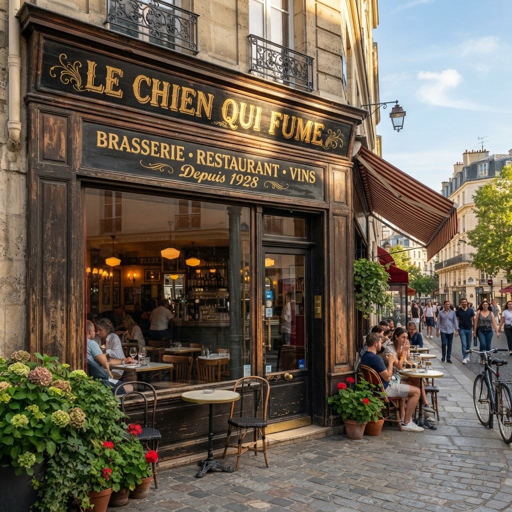
Parisian typography is not a monolith; it is a layered history of art movements. When curating your boards, you should look for the distinction between the formal, rigid signs of the municipal government and the expressive, artistic signs of private businesses. The interplay between these two styles defines the Parisian streets.
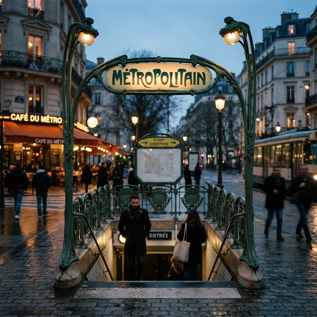
Art Nouveau Influence
Look no further than the Metro entrances designed by Hector Guimard. These signs feature flowing, organic lines and floral motifs that epitomize the Art Nouveau movement. Incorporating this style into your aesthetic boards adds a touch of bohemian flair that feels distinctly early 20th-century Parisian.
The Boldness of Art Deco
Conversely, the interwar period brought us the sharp, geometric lines of Art Deco. If you prefer a more modern, structured look for your mood boards, focus on signs from the 1920s and 1930s. These signs often feature metallic accents and sans-serif fonts that feel incredibly contemporary even today.
Sourcing Inspiration for Your Aesthetic Boards
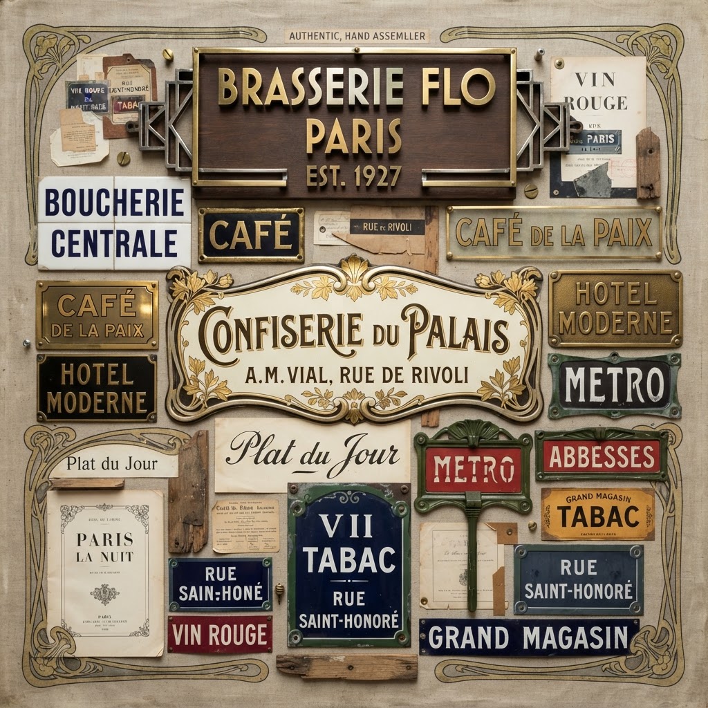
Building a high-quality vintage aesthetic board requires more than just finding stock images. It requires an eye for detail and context. To create a cohesive look, try to group your visual elements by era or by the specific architectural style of the Parisian neighborhood you are referencing.
Categorizing Your Finds
One effective method is to create sub-categories for your inspiration. For example, keep your ‘Street Name Plates’ separate from your ‘Bistro and Cafe Signage.’ This separation allows you to see the contrast between government-mandated infrastructure and the personal, expressive branding of Parisian restaurateurs.
Digital Tools and Archival Sources
Utilize digital archives like the Gallica database or specialized typography websites to find high-resolution examples of old French street signs. Many typography enthusiasts have documented these signs meticulously, providing a wealth of information about the specific typefaces used during different decades of the 20th century.
The Role of Color in French Typography
While we associate the city with blue and white, the broader spectrum of vintage Parisian signage is quite diverse. Old shopfronts often utilized gold leaf lettering on dark wood backgrounds, creating an opulent and luxurious feel that contrasts sharply with the utilitarian blue street signs.
Gold Leaf and Glass
If your aesthetic board is aiming for a more romantic, old-world vibe, prioritize images of ‘eglomise’—a technique where gold leaf is applied to the back of glass. This provides a reflective, textured quality that is difficult to replicate with flat digital fonts and adds instant depth to your compositions.
The Pastel Palette of Boutique Signage
For a softer aesthetic, explore the vintage signage of Parisian boutiques from the 1950s. These often used playful, rounded fonts in pastel colors like mint green, soft pink, and buttery yellow. This specific style works exceptionally well for lifestyle-focused aesthetic boards that celebrate the softer side of French culture.
Typography Techniques for DIY Projects
If you want to create your own vintage-style signs, you can emulate the Parisian look using modern design tools. The secret lies in the spacing—or ‘kerning’—and the specific proportions of the letters. Parisian signs often use a wide, airy spacing that allows the letters to breathe against their background.
Choosing the Right Font
When choosing fonts, look for typefaces that draw inspiration from historical French posters. Fonts like ‘Didot’ or ‘Bodoni’ are classic choices, but for a more ‘on-the-street’ feel, search for typefaces classified as ‘Antique’ or ‘Grotesque’ that mimic the hand-painted variations found on older Parisian storefronts.
Emulating the Hand-Painted Look
To make your digital creations feel more authentic, don’t be afraid to add slight imperfections. A perfect vector file often lacks the soul of a real vintage sign. Consider adding a subtle grain or texture overlay to your final design to simulate the weathered enamel or peeling paint found on genuine Parisian artifacts.
Common Pitfalls to Avoid
When building your aesthetic boards, avoid the trap of mixing too many conflicting styles. While Paris is eclectic, it is also highly intentional. A common mistake is placing overly modern, digital-looking neon signage alongside classic 19th-century metal signs. If you must mix them, ensure there is a clear thematic link, such as color palette or typography weight.
Consistency is Key
Select a primary color scheme and a handful of fonts that complement each other. By limiting your palette, you allow the details of the typography to shine through. Remember that the goal is to curate, not just to collect. Every element on your board should serve the overall narrative you are trying to tell about Parisian history and design.
Conclusion
Paris street signs and vintage typography are more than just navigational tools; they are the visual heartbeat of one of the world’s most beautiful cities. By understanding the history, color theory, and typographic principles behind these signs, you can elevate your vintage aesthetic boards to a professional level. Whether you are a designer, a traveler, or simply a fan of French culture, there is endless beauty to be found in the letters that line the streets of Paris. Start exploring these styles today and bring a piece of Parisian magic to your own creative projects. Don’t forget to share your curated boards with us on social media using our hashtag to join our creative community!
Leave a Reply