
Mastering the British Aesthetic: Red Buses & Vintage Vibes
To master the British aesthetic, combine high-contrast “pillar-box” red focal points—like iconic London buses—with a base palette of muted, weathered textures and historical architectural elements. This visual style relies on balancing the grit of urban London street photography with the refined, nostalgic charm of traditional interior decor.
The Allure of the Iconic Red Bus
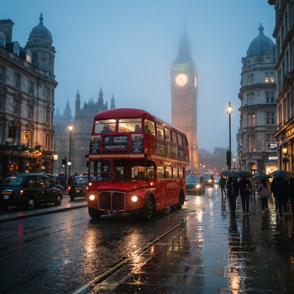
The vibrant crimson of a London transport vehicle creates a magnetic focal point against a gray, misty skyline that defines the classic British street aesthetic. When integrating these into your design projects, focus on the rule of contrast: the high-saturation red acts as a visual anchor that draws the eye immediately. By utilizing the iconic Routemaster bus as a centerpiece, you establish a narrative that feels both modern and deeply rooted in 20th-century history. For photography, look to capture these vehicles during “blue hour” or on overcast days when the diffused lighting eliminates harsh shadows, allowing the red paint to pop naturally. The bus is not merely a mode of transport but a symbol of reliability and heritage; placing it within a frame dominated by cool-toned architectural backdrops provides the necessary separation to make the image sing. Whether for digital art or interior design, remember that the bus’s placement should follow the rule of thirds to maintain a professional, cinematic composition.
Practical Photography Tips
To capture the perfect shot of a red bus, look for reflections in puddles or wet cobblestone streets. These natural elements enhance the nostalgic photography potential of the scene, reflecting the iconic shape and color in a way that feels cinematic and timeless.
Styling the English Flag for Modern Spaces
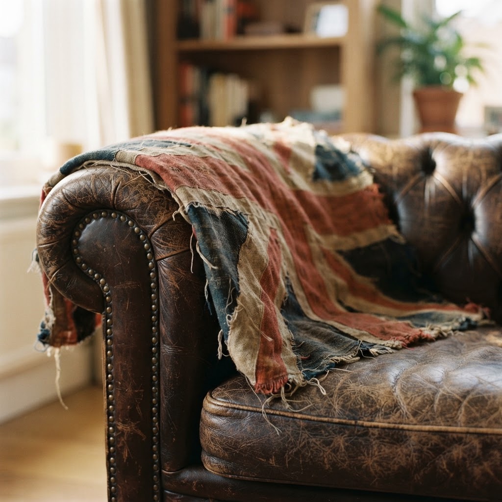
Incorporating the Union Jack into modern interiors requires prioritizing texture and subtlety over literal, high-gloss branding to maintain an authentic vintage feel. Instead of using pristine, factory-new flags, decorators should source distressed prints or vintage-washed textiles that suggest history and use. This approach aligns with the core philosophy of classic British decor, where the “lived-in” quality of an object is prioritized over its brand-new appearance. To implement this, place flag-inspired accents—such as throw pillows or wall art—against neutral backdrops like Farrow & Ball-style “Elephant’s Breath” or “Down Pipe” shades. These muted, complex grays and navies provide the necessary visual “quiet” to allow the bold red and blue geometry of the flag to serve as an accent rather than a chaotic focal point. By choosing high-quality materials like heavy-weave cotton or linen, you elevate the aesthetic from a kitschy souvenir look to a sophisticated design statement that speaks to heritage.
Achieving the Perfect Vintage Vibes
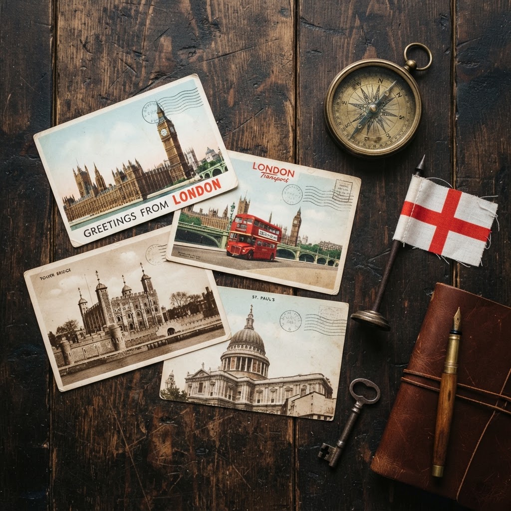
Vintage vibes are defined by a deliberate marriage of conflicting eras, where the objective is to create a cohesive narrative through texture and storytelling. A successful British-inspired room often pairs an heirloom-quality antique leather armchair with modern, minimalist metal lighting to bridge the gap between 19th-century comfort and 21st-century functionality. When curating your space, focus on these five essential elements to ensure authenticity:
- Weathered leather and velvet upholstery: Look for “distressed” finishes that show signs of age.
- Antique brass hardware: Unlacquered brass, which develops a patina over time, is superior to polished gold.
- Bookshelves: Use dark wood shelving packed with classic literature to create a scholarly, timeless atmosphere.
- Monochromatic maps: Framed, vintage-style London maps add historical scale to a room.
- Ornate picture frames: These provide the perfect contrast to modern, candid street photography.
By mixing these heavy, traditional elements with sleek, contemporary structural pieces, you avoid creating a “museum” look and instead build a space that feels dynamic, personal, and profoundly British.
Architectural Inspiration and Design
London street aesthetic is defined by its architectural layers, ranging from ornate Victorian facades to the stark, functionalist brutalist structures of the post-war era. Successful design requires embracing this juxtaposition, using the contrast between Georgian elegance and the industrial grit of railway arches as a backdrop. To evoke this feel, prioritize materials that resonate with London’s specific atmosphere: dark wood, polished slate, and aged copper. Architects and interior designers often note that the city’s character is built on these contrasting textures, which reflect the changing weather and long history of the landscape. For your digital art or interior schemes, lean into these material choices to create depth. For example, placing a high-contrast red bus against a rough, Victorian brick facade immediately communicates “London” more effectively than any generic cityscape. By understanding the architectural language—the way stone weathers or how ironwork patterns emerge—you can curate an environment that feels historically accurate and aesthetically cohesive.
Curating a Nostalgic Portfolio
For creative professionals building a portfolio, the British aesthetic relies on a strictly controlled color palette of muted, desaturated tones punctuated by sharp, high-intensity highlights. To achieve consistency, your base should consist of “London gray” or cool blue undertones that mimic the city’s notoriously overcast weather. Against these cool, desaturated backgrounds, use specific “pillar-box” red accents that hover around the hex code #C8102E. This specific shade of red is consistent with royal mail boxes and public transport, providing a universally recognizable color anchor. When editing photographs or designing brand identities, ensure your shadows retain a subtle blue cast to maintain that English atmosphere. Consistency is your most important tool; whether designing a website or curating a gallery, repeating the same color logic throughout the project helps the viewer subconsciously recognize the “British” theme before they even focus on the subject matter.
Beyond the Stereotypes
Sophisticated design moves beyond obvious, cliché imagery to find the quiet, intimate moments that truly define the British experience. Instead of relying solely on high-profile landmarks like Big Ben, focus on the texture of a fog-covered bridge at dawn, the condensation on a pub window, or the specific lighting of a brick alleyway. These subtle details create a layered visual experience that feels honest rather than staged for a tourist. Successful creators look for the “in-between” spaces—the quiet streets in South Kensington or the industrial textures of East London—which provide more authentic narrative material. By shifting the focus to these nuanced details, you move from producing generic “British-style” work to creating content that feels lived-in and genuinely nostalgic.
FAQ
What are the key colors for a British aesthetic?
The primary colors for a British aesthetic are muted, cool-toned neutrals—specifically grays, navies, and slate—punctuated by high-contrast “pillar-box” red. This combination replicates the visual balance of London’s overcast skies against its iconic red transit vehicles and telephone booths.
How can I make my home look more “British”?
To achieve a British look, incorporate layers of textures such as weathered leather, velvet, and aged brass alongside antique literature and monochromatic historical maps. Mixing these traditional materials with a neutral, cool-toned color palette creates a sophisticated, heritage-inspired atmosphere that avoids feeling like a cliché souvenir shop.
What is the secret to photographing London buses?
The secret to photographing London buses is to shoot during overcast weather or at twilight to achieve natural color saturation and reduced harsh reflections. Incorporating reflections from wet cobblestones or puddles creates a cinematic, nostalgic quality that makes the vibrant red pop against the gray, atmospheric background.
Should I use real flags for decoration?
Avoid using new, high-gloss flags as wall decor; instead, opt for distressed prints, vintage-washed textiles, or subtle patterns on cushions and upholstery. Using aged, weathered materials maintains a sophisticated, authentic vintage vibe rather than the bright, plastic-like appearance of mass-produced tourist items.
Why does the British aesthetic use cool-toned shadows?
Cool-toned shadows are used in the British aesthetic to mimic the natural diffusion of light through the United Kingdom’s frequent cloud cover and fog. This blue-leaning color temperature acts as a perfect visual complement to the warm, vibrant red highlights, making them stand out with greater intensity.
Leave a Reply